
Did Global Warming cause the 2021 Valentine’s Day Arctic event...
Summary
The weekend of Valentine’s Day 2021 in Texas as well as other states in the US got a taste of an extreme Arctic Blast that set numerous records and exposed us to subzero windchills and prolonged periods of bitter below freezing temperatures that have not been seen in this area in decades. And of course, after the event we begin hearing stories how Anthropogenic Global Warming (AGW) can cause extreme winter events, essentially making the illogical statement that “Global Warming makes it colder in the winter”. As a Geoscientist in the Oil & Gas business you learn not to take any statements serious without some type of evidence, and it should be possible to utilize publicly available information to find out what the cause if any is associated with this extreme weather event.
The notion of Global Warming causing more severe winters is just a theory or rather a hypothesis with little to no supporting evidence, and it was conceived by Dr. Jennifer Francis at the Woodwell Climate Research Center. This theory states that because of the warming arctic or Arctic Amplification, the polar vortex which keeps a mass of very cold air bottled up, has trouble maintaining its hold because the arctic jet stream becomes wavy because of the temperature gradient at the vortex outer boundary and losses containment of the cold air mass which causes a deep southern penetrating surge of Arctic air. Of course, many inspiring climate scientists jumped on this hypothesis like a duck on a June bug as well as the media and now it is being presented as fact. But there is a sizable group of scientists who have their doubts about the impact of climate change and Arctic amplification of the jet stream.
One thing that scientist can agree on that the event was caused by a sudden Stratospheric Warming. Can Global Warming cause colder winters, this ridiculous question is not as easy one to answer from a scientific point of view because evidence must be presented to nullify, even an illogical statement such as this. So, let us start out by investigating the Global Warming theory. We all know the world is warming, is there definitive proof that it is caused by an enhanced greenhouse process driven by human CO2 emissions.
What is Global Warming
Anthropogenic Global Warming (AGW) is a theory that almost every human on the planet is aware of and think they know something about it, and basically states that we homo sapiens are responsible for artificially warming our planet because of our combustion of fossil fuels and the resultant emissions of various gasses primarily CO2 which are slowing down the radiant energy leaving our planet’s surface and causing an increase in the average temperature of Earth’s atmosphere. From before the onset of the industrial revolution to current times, atmospheric CO2 levels have increased from 285 parts per million (ppm) to 415 ppm as of 2/26/2021. Some argue that CO2 levels of 285 PPM were dangerously low for the biosphere, and that land-based photosynthesis was struggling to maintain at such low levels. There is no doubt during the last few of decades Earth’s climate has warmed and winters on average have not been as severe. But how can we know if it is natural, or our emissions are causing it.
“in Commercial Science, you must try to continually kill the idea, and as hard as it is, you must walk away or perhaps pivot your theory.”
As a Geoscientist in the Oil & Gas Exploration Industry I am often faced with minimal data and extreme risk when attempting to use science to validate ideas below the subsurface where oil & gas accumulations exist. We use seismic data, essentially a huge sonogram of the subsurface, and there are many pitfalls in seismic signal analysis when attempting to relate seismic data to the Earths depositional sequences, Geology, Fluid Content and Lithology changes, that can cause multi-million-dollar losses (dry holes) if you are wrong. In commercial Science, you must try to continually kill the idea, and as hard as it is, you must walk away or perhaps pivot your theory.
So, why not take the same approach I would take to fast track and evaluate an oil & gas prospect as a pure Epistemological approach and do not use bias in the zeal to attempt to prove as well as disprove the theory of AGW with real world measurements.
So, to start out let us look at Earths atmospheric CO2 levels and temperature but let’s do it over a range of data that only includes the digital revolution.
The graphs below show Atmospheric CO2 levels in Parts Per Million (PPM) recorded at Mauna Loa Hawaii as well as growth and temperature since 1980. And for the temperature data we are currently only interested in the Tropics because that is where the AGW theory is predicted to be most effective. CO2 growth is important because it shows us how much CO2 is going into the atmosphere from year to year, and finally we see the average temperature of the surface along -20 to 20 degrees of latitude, (Tropics).
Figure 1
As you can see in the graph in figure 1, CO2 levels have been increasing roughly by 1 - 3 ppm annually since 1980 until current. And according to the theory of Global Warming this increase in atmospheric CO2 levels is causing more heat to be captured in the middle atmosphere and causing the Earth to warm at a rate that is faster than would have occurred without the human generated CO2.
The previous plot shows the standard graph of CO2 and how it is increasing in PPM, but it does not relate to Gigatons which is the unit of measurement for Anthropogenic emissions data , so let us convert the Atmospheric CO2 level growth rate to Gigatons of CO2 and compare it with the Global Emissions data and see how humanities Global emission levels compare to what the annual change in atmospheric CO2 in Gigatons as detected by Hawaii.
Figure 2
As we can see humanities annual CO2 emisions are quite larger than the CO2 buildup being monitored in the atmosphere.
The accumulated weight of our emissions compared to the weight of what is detected in the atmosphere…
Figure 3
Humanity is certainly pouring a lot of CO2 into the atmosphere, and this seems alarming. But equally intriguing is the question, where is all the CO2 not detected at Mauna Loa going. Certainly some quantity is being absorbed directly by the biosphere and another quantity is being absorbed by the oceans, but we are here to attempt to validate or invalidate the claims made about the AGW theory, so lets move on….
That’s a lot of CO2, so is GLOBAL WARMING Natural, Artificial or A Little of both…
Climate models predict that the increasing atmospheric CO2 levels are heating up the atmosphere and the effect of this enhanced greenhouse process should be most evident in the middle portion of the atmosphere centered around 5 kilometers in altitude. The heat leaving the surface should be intercepted by greenhouse gasses and should cause the middle atmosphere to warm at a higher rate than the surface over time.
The climate models specifically make these predictions along the tropical equator ranging from -20 Deg. to +20 Deg latitude, and through this cross-section of Earths climate, the searing downwelling and upwelling heat of the Tropics are moving the most amount of energy.
So we have established that the average global temperature has been increasing and atmospheric CO2 levels have been increasing, so does this mean that the increasing levels of CO2 are causing the planet to warm up as the theory states. The answer to this question is not an easy one to answer because anyone in a science or statistical background clearly understands the correlation / causation paradigm.
We have all heard that Global Warming is an existential threat and perhaps the biggest one that humanity has ever faced. We have been told that if we do not act soon Earths climate will have reached a tipping point and sea level rise will accelerate, weather patterns will become chaotic, hurricane intensity and frequency will increase, tornado intensity and frequency will increase, droughts will increase, expansion of deserts and so on and so on.
That is certainly a harrowing prediction and one that policy makers should pay attention to and for good reason. So have we seen any of these predictions come true? The answer is an absolute maybe, there have been arguments for and against trends in change in hurricane frequency or intensity, change in droughts, tornadoes and flooding. However we know that accelerating sea level rise is not happening and the deserts are becoming greener and crop yields are more abundant than ever.
One could spend many months cobbling together various data metrics to validate all of the claims about increasing severe weather events. But less take a look at the claim that Global Warming will cause more hurricanes, by downloading and graphing historical Atlantic hurricane data and see if we detect an increase in hurricane activity.
So we clearly see an increase in hurricane activity from 1975 and the fit of the blue line indicates that the total number of storms per year is increasing at a rate of 2.2 per decade. Also note the record setting 2020 season making it almost certain that Atlantic Storm activity is increasing with over 45 years of data that shows a trend with a very robust fit and is more than likely because of a warming planet, be it natural or artificial.
Seems logical, a warming planet should have more Hurricanes and Tropical Storms and evidence of this is certainly apparent in the data.
So where do all of these alarming predictions come from and how can we know that they will all actually come true one day? Enter the Climate Model, the first climate models were created in the 1960’s and have been continually modified and enhanced throughout the decades and now utilize massive amounts of computing power and incorporate various types of data from land, sea and air to predict future climate as well as future globally averaged temperatures.
And it appears that they are actually able to predict the future warming with some degree of accuracy, so does this mean that they are accurate? The answer to this question at least according to science is no. Again in science correlation does not mean causation and the planet has observed numerous warming and cooling trends throughout human history that could not have anything to do with changes in atmospheric CO2 levels.
So how do we gauge the accuracy of a climate model? The projected average temperature of the planet can be modeled with a simple least squares fit as long as the warming trend continues. But climate models have been designed to account for increasing atmospheric greenhouse gasses and predict chaotic changes in weather patterns, accelerating sea level rise and all of the various alarming predictions that we continually hear based on projected increases in atmospheric CO2 and other atmospheric GHG molecules.
One theoretically critical claim that climate models (and Climate Science) predict is that the greenhouse gasses in the middle layers of the troposphere particularly in the tropics, are capturing or scattering the heat leaving the surface and are causing the middle part of our atmosphere to warm up faster than the surface along the equator. Climate models also predict that because of the capture of heat in the middle troposphere, the lower Stratosphere should exhibit a decrease in temperature over time because the heat escaping the surface is being dispersed thousands of meters below and not allowed to add heat to the lower Stratosphere.
This all seems very logical and is not difficult to verify because we have had Satellites orbiting the Earth since 1978 that have been measuring the temperature at all levels of the atmosphere as well as monitoring global sea ice for 44 years. With 44 years of global data that does in fact measure the lower atmosphere, the middle atmosphere and the lower Stratosphere we should clearly see this enhanced greenhouse signature in the atmosphere that climate models predict within our atmosphere, and science demands that these real world measurements be verified in order to give credibility to any of the climate model predictions.
Figure 4 shows a cross-section of Earths atmosphere at the equator and the approximate altitudes for the three temperature time series we will be using to look for an enhanced greenhouse signature.
Figure 4
The series of Graphs below in figure 5 show the Lower Stratosphere, the Middle Troposphere and Lower Troposphere (Surface).
The Lower Stratosphere has two major volcanic episodes that have caused an anomalous stepped cooling trend following the El-Chichon and Pinatubo volcanic SO2 events and have caused complications when looking for an AGW signal during the 80’s & 90’s, but outside the major SO2 events there appears to be a clean 25 year time range between 1995 and 2019 that is not subject to extreme volcanic SO2 radiative interference that we can measure the Lower Stratosphere temperature gradient.
The Lower and Middle Troposphere clearly show warming over the period and to be consistent I have measured the Slope of each using the same 1995 – 2019 time range as to leave out the effects of any SO2 cooling in the Troposphere.
Climate models predict that the Middle Troposphere should show as much as a 30% increase in warming relative to the surface. The actuall warming ratio predicted will vary with the Climate Models climate sensitivity setting. Any amount of warming in the Middle Troposphere greater than the Lower Troposphere will prevent the scientific process from condeming the AGW theory and if the Lower Stratosphere shows a cooling trend then the AGW theory becomes a working theory with multiple metrics of supporting evidence.
Figure 5
Below in figure 6 are the three different time series from 1995 – 2019 with the linear regression slopes displayed for each as well as their slope in degrees per decade annotated to the left. We have 25 years of good data not influenced by major volcanic SO2 events and now we can see if the Lower Stratosphere shows cooling and the Middle Troposphere shows more warming than the lower Troposphere or surface.
Figure 6
Figure 6 clearly shows that the Lower Stratosphere does in fact have a cooling trend of -.09 degrees per decade and the middle Troposphere shows a warming trend .001 C per decade greater than the surface. Even though the greater middle Troposphere trend of .001 C / Decade larger than the lower Troposphere is quite small, (TMT Diff = +0.9%) it cannot be ignored especially considering that there is some debate about the mixing of signals that are used to measure the different layers of the atmosphere utilizing the satellite data.
Some might consider a 0.9% increase as statistically insignificant because climate models are predicting much larger numbers, certainly over 20%. However if you are skeptical of CO2 as a primary driver of climate this is about what one would expect if you believe that our emissions should have some detectable influence of the greenhouse process but should be minimal.
It should also be noted that the slope of the atmospheric tropical temperature indicates that if the trend continues, the tropics will warm by 1.1 Degrees C in the next 100 years and the middle atmosphere is only increasing at a rate of 0.9% greater than the surface so either way the Global Warming trend is very minimal along the equator. The historical climate record tells us with absolute certainty that the planet is either warming or cooling, temperature trends have never been flat at any time scale, so there is certainly natural variability in the warming trend.
So is there a detectable AGW signature in the data? Yes definitely, how much exactly?, according to the data 1% at most, but some of the Stratospheric cooling trend could possibly be because of ozone depletion from our emissions of fluorocarbons and other Halo Based Molecules ,as well as natural processes (Volcanics) which ozone destruction causes cooling in the Stratosphere and causes subsequent warming at the surface. This phenomena occurs because ozone (O3) blocks significant amounts of ultraviolet radiation from the Sun and when ozone levels are lowered in the Stratospheric Ozone layer, more UV radiation reaches the surface and causes warming at the surface and no longer gets scattered or blocked in the Stratosphere to provide the Stratosphere warmth so the effect should be measurable over time in both atmospheric components. Ozone has been measured and there is evidence that Ozone has been depleted significantly since 1980.
Unfortunately it is not an easy task to analyze ozone data for the proper altitude, because ozone measurements in the atmosphere are very sparsely distributed and there are a series of problems when attempting to find monthly Stratospheric Ozone levels sampled continuously for 25 years but figure 7 clearly shows that ozone levels have been showing a significant decline since 1980 and appear to have suffered irreparable damage because of volcanic events.
Figure 7
Figure 7 lends credibility to the lower Stratospheric cooling trend being associated with ozone depletion and the complex ultraviolet radiative processes that affect Stratospheric temperature trends with decadal changes in the ozone layer.
But what happened to ozone levels after 2002, the graph above came from Wikipedia and after an exhaustive web search that did not lead to any information about ozone levels in more recent times, except voluminous content about the ozone hole in Antarctica I decided to build a few time series from a weather balloon dataset.
I decided to use a dataset from Trinidad Head, California and they have been launching multiple flights per month from 1997 until current. Trinidad Head is located at a latitude of 41.06 Degrees which is outside the 20 Degree optimum tropical greenhouse window, but a mid latitude sampling should at least give some idea about ozone distribution for over 2 decades over Northern California, and maybe some temperature measurements. Weather Balloon or more technically referred to as Radio Sonde data are recorded as a separate file for each flight and the dataset as of this moment contains 1250 flights. And each flight file contains Ozone PPM, Temperature, Pressure etc.. for each altitude as the balloon ascends. So I wrote an algorithm to extract data for the Lower Stratosphere, The Mid Troposphere and the Lower Troposphere.
The graphs below show average Lower Stratospheric Temperature and Average Lower Stratosphere Ozone levels for each flight and one should note that these are not anomalies these are actual temperatures with all of the seasonal variations. The Lower Stratosphere temperature graph shows us that there is no decadal trend and that a large spike in stratospheric temperature occurred late in 2020. The ozone graph tells us that there is also no statistically meaningful trend and ozone levels are maintaining fairly constant levels on average, only decreasing by 0.5% per decade.
Figure 8
The following graph compares the 3 different Radio Sonde atmospheric layer temperature time series similar to the previous analysis of the satellite data, and I have omitted the effects of the Taal eruption so we can get the optimum data range for detecting an Anthropogenic Greenhouse Signature.
Figure 9
The graphs in figure 9 tell us that both the Lower Stratosphere and Lower Troposphere have no trend and are essentially flat. But the Middle Troposphere has a detectable trend that indicates the middle atmosphere is warming faster than the surface.
So we see that the lower stratosphere over Northern California does not show much of a declining Ozone trend nor does it show a declining Stratospheric Temperature Trend, but does in fact show warming in the middle Troposphere which very weakly supports the AGW theory.
The fact that there is no meaningful decline in ozone levels, would lend credibility that the cooling observed in the satellite Lower Stratosphere could be more associated with AGW than a decadal Stratospheric Ozone depletion.
The atmospheric layers definitely have a detectable signature of Greenhouse Warming ( 1%), but the effect seems to be very gradual and extremely minimal through the period of analysis.
Less get smaller by looking at a fixed surface measurement.
We have looked at a multiple globally gridded temperature datasets, storm data and an active weather balloon dataset and we have found very minimal supporting evidence for the AGW theory, with only a very small influence, so lets take a look at a Surface Temperature Time Series in a major metropolitan area. Since I live in the Houston Area why not look at something that is representative of what millions as well as I have lived.
So I downloaded the unadjusted and unhomogenized dataset from Nasa GISS Temp for Houston Intercontinental Airport and graphed the Winter and Summer temperatures from 1950 until current. There could be some urban heat island effects and the record only goes back to 1947 and there is always the argument about the 1930’s being warmer, but 70 years of data is a good run of data and this is what we have lived through.
Figure 10
Figure 10 tells us that 70 years of data indicates Houston Summers are getting warmer at the rate of 0.139 Degrees C per Decade and Houston winters are getting cooler by -.036 Degrees C per decade. Since we are using unadjusted data there could be some urban heat island effects but a cooler winter trend may not be associated with urban heat island effects. The data however indicates that if the trend in summer time temperatures continue for a few decades it will become a bit (more) unpleasant during the summer, but hardly a disaster. And that Winters in the 1950’s were similar if not warmer than current.
The data from the Nasa GISS that we looked at is monthly averaged data, and with this granularity the 2021 Valentines day extreme Arctic cold event would not even show up, so let us take a look at hourly data from an official NOAA weather station that is maintained at the Conroe airport, which is around 25 miles north of the Houston Intercontinental Airport that we just examined.
The Noaa weather data is quite large and contains numerous data columns for every hour of the day associated with temperature, dewpoint, windspeed etc.. Looking at the entire range even daily would present too dense of a graph to display 14 years of data so the following graph shows the Conroe data as a weekly averaged dataset, with high low departure from average and average weekly temperatures.
Figure 11
The graphs in figure 11 tell us that on average over the last 14 years the Conroe area is getting warmer by the rate of .0364 Degrees Fahrenheit per decade and the High temperature anomalies are increasing at .052 F per decade, but night time low temperatures are warming at an impressive .26 Degrees per decade. The last three data points show the bitter average, high and low departure from averages associated with the Valentines Day event.
Since we have hourly data with more than just temps, just for fun let us look at average weekly windspeed and humidity and see if there are any trends present in the 14 year record. Before I went through the trouble to extract monthly Temperature and Windspeed averages I thought I would look at the site on Google Earth according to the published lat lons to check the station placement and much to my surprise there was not a weather station there. So after utilizing Googles historical imagery I was able to surmise that the station had been moved because of an airport expansion project, so any decent researcher should document a change in instrumentation and or location, and the following slide contains some historical aireal imagery of the location change.
So after a brief distraction with the station location change the following graph shows a composite graph of the monthly data for multiple items from the NOAA Conroe weather station, and since humidity, Fahrenheit and windspeed (in MPH) all have the same general value range they can all be displayed on a single graph.
Figure 12
The graph in Figure 12 above tells us that the windspeed trend is near flat but humidity is increasing at the rate of .57% per decade and from the low temperature departure from the average slope from the previous graph of .26 Degrees F. per decade we see that the area is getting more humid and nights are getting warmer, and average temperatures are getting warmer but at a much slower rate than nightly lows. Fourteen years of data is probably to small of a time range to draw any climatic conclusions, but needless to say the data indicates warming.
So in summary we have found that there is a very small global warming signature detected in Earths atmosphere and appears to be much smaller than what Climate Models have been predicting so that tells us that the models are not predicting what is being observed in the atmosphere and this cast doubt on any predictions that climate models make about severity of winter events associated with Earths atmospheric CO2 levels.
This fact has not gone unnoticed by Climate Scientists and there have been many attempts at resolving this ambiguity and the Climate community essentially decided to just believe in the models and move on. Consensus and or faith is not science, and the data shows that the Global Warming narrative is essentially overhyped and any model predictions cannot be taken seriously until the null hypothesis conflict associated with the lack of predicted strength of observed mid tropospheric warming has been resolved.
As Einstein said, “No amount of experimentation can ever prove me right. A single experiment can prove me wrong”, so it would appear that blaming extreme winter events on AGW is wrong.
The most likely explanation for extreme winter events is that aerosols and particulate matter in the Stratosphere are causing instabilities which lead to the Polar Vortex related intrusion of Arctic air to the deep south.
Before we jump into analyzing Historical Stratospheric volcanic influence let us now take a more detailed look at the weather event and graph the data at a one hour rate and a time range 7 days before the Valentines Day Event and 7 days after the event in question.
Figure 13
Figure 13 shows a composite plot of humidity temperature and windspeed as well as a graph of power generation in gigawatts by energy type through the period. The temperature graph shows a week long series of diminishing temperatures followed by the main Arctic push on Valentines day night. The power infrastructure, particularly natural gas had been ramping up a week prior to the event to meet the demand associated with the week long decline in temperatures, but buckled during the overwhelming conditions at the peak of the event. A managed attempt was made at rolling blackouts to handle the electricity shortage, but lead to sustained blackouts for millions for a few days and some as long as 18 days before all the damage was repaired.
No doubt that this was a highly unusual event, but was it a side effect of Global Warming? The data indicates that there is very little chance, since a Global Warming signature is barely detectable in the atmosphere. There is no doubt in my mind that the fierce Arctic intrusion was associated with the anomlous spike observed in Stratospheric temperatures. This was a very unusual anomaly in that there is nothing similar to it has occurred in the Stratosphere since the 1991 Pinatubo Erruption (Of course much larger then), which is reported to have dropped global temperatures, but the immediate post Pinatubo temperature record does not show extreme winter events for the Houston area.
And the same thing happened after 1982 El Chichon volcanic eruption in which this area suffered intense and destructive winter conditions for two winters a couple of years subsequent to the eruption and is the most severe event in the period of analysis.
So an anomalous Stratosphere warming detected in both a satellite dataset as well as a RadioSonde dataset just a few months after volcanoes that where known to inject SO2 into the Stratosphere would seem to put the weight of the evidence for the cause of the fierce Valentines Day Arctic surge on Sulfur Dioxide (SO2) from natural volcanics and not an enhanced Anthropogenic Atmospheric Greenhouse process.
The Sulfur Dioxide takes a few months to convert to Sulfuric Acid, but once the sulfuric acid clouds (highly reflective) form in the Stratosphere they can reflect a large amount of solar radiation before it ever has a chance to touch the surface, these Sulfuric clouds are short lived but can cause significant temporary radiative imbalances in the climate system far more quickly than the effect of gradual increases in greenhouses gasses. Also ash and other particulate matter can be injected by Volcanic eruptions and even extreme natural events such as the Australian Brushfires can load the Stratosphere with substantial amounts of particulate matter that also serve to capture heat radiating from the surface as well as prevent sunlight from reaching the surface.
We have over 40 years of data, let us put it all together and see if the evidence justifies the hypothesis that the extreme cold event was caused by natural causes and had nothing whatsoever to do with natural or artificial global warming. You can pound the table all you want about beliefs but in science you have data to support a theory or hypothesis or you are just talking.
So let us compare 1980 – 2000 with all volcanoes that injected material into the stratosphere as well as 2000 to current, and compare against known extreme winter events in North Houston.
Below is a graph (Figure 14) of North Houston Highs and Lows, Northern and Southern Hemisphere Lower Stratosphere temperature anomalies from 1980 – 2000. Annotated across the top are volcanic eruptions that have a Volcanic Explosivity Index (VEI) of 4 or above and also had confirmation of a plume piercing the Stratosphere (50,000 Ft). The graph also has small blue boxes on the High temperature graph that represents multi-day high temps at or below 32 degrees and Low Temperatures that were below 20 degrees Fahrenheit. The graph shows that during the 80’s and 90’s there were 7 events and all occurred within a couple of years of major volcanic events, but there were no more extreme winter events after 1996 and coincidently there were no major volcanic eruptions after 1996. Another interesting point the graph shows is that there was no immediate (2 years) extreme winter weather events following the 1991 Mt. Pinatubo eruption. The 1991 Pinatubo eruption was the largest eruption of the period with a VEI-6 strength and injected 20 million tons of SO2 into the Stratosphere and injected more particulate matter into the Stratosphere than any eruption since the 1883 Krakatoa eruption.
Stratospheric Injections 1980 – 2000
Figure 14
Stratospheric Injections 2000 - 2021
Figure 15
The graph above (Figure 15) is the same as the previous but with a date range of 2000 until March 2021 and shows that there were no extreme winter events in the North Houston area until 2010 and there were also no major volcanic eruptions until 2009. We also see that there were multiple volcanic events in conjunction with the Australian Brushfires. The Australian brushfires are responsible for a significant amount of particulate matter in the stratosphere and even though that is an event in the Southern Hemisphere the sheer volume of particulate matter and aerosols that were continually added to the Stratosphere starting in 2018 from volcanic activity and brushfires just two years before the extreme Arctic weather event increase the odds that the event is because of complications in the Stratosphere associated with Stratospheric aerosols and particulate matter.
The scientific community still has a significant lack of understanding about the mechanisms at work in the Stratosphere, but it is a forgone conclusion that all energy leaving and entering our planet must travel through the stratosphere and any change to the chemistry of the stratosphere seems to have multi-year consequences to weather at the surface. And the two graphs above show that between 1997 and 2008 there were no major volcanic events and there were also no extreme arctic intrusions in the Houston Texas area. Does this prove that the event was caused by Stratospheric aerosols? Well, in the world of science, proof is only as good as the evidence until more evidence disproves your hypothesis, but the evidence points to Stratospheric Aerosols as the culprit.
Conclusion:
The evidence presented indicates that the AGW theory is only responsible for a very small amount of warming and shows no mechanisms that would justify a sudden Stratospheric Warming event, and the 11 year hiatus of extreme cold events in conjunction with a hiatus of extreme volcanic activity supports the notion that this event was associated with natural processes and the historical data indicates that there is a high probability that the Northern Hemisphere will likely see a similar event next winter.
The data analyzed indicate extreme winter events seem to be associated with Volcanic and other disruptions in the composition and chemistry of the Stratosphere and not artificial or natural warming of the atmosphere by greenhouse gasses.
This exercise has demonstrated the shear amount of the weight of CO2 being emitted in relation to what is actually building up in the atmosphere. A rudimentary set of atmospheric linear regression slopes created for the appropriate time series that I thought would invalidate the AGW theory actually lends credibility to the theory, but in a context that there is no tipping point and no existential threat but a very minimal measurable greenhouse signature can be detected. We have been emitting a considerable amount of carbon into the atmosphere at a rate that is swamping the buildup that is actually being measured and this has been going on for decades.
There is no existential threat based on Greenhouse Warming at least not in the mechanisms that current climate models predict, Earths climate appears to be insensitive to an influx of huge amounts of greenhouse gasses but must obey the laws of physics and does indeed show a small greenhouse signature in the amount of 1% (with much degree of uncertainty).
The large amount of Anthropogenic CO2 emitted that is not dwelling in the atmosphere must be accounted for to fully understand the total impact of our emissions. One alarm being raised is that much of this CO2 is being absorbed by the oceans which could lead to acidification of the Oceans baseline PH level, which could negatively impact marine ecosystems. Another example of an alternative climatic effect of CO2 is the reports from NASA and other organizations that we are greening the planet at an ever increasing rate. A recent report cited that the Sahara Desert has recently shrank by 700,000 Sq. Kilometers. Satellites have also detected greening in the Arctic.
If half of our emissions are being utilized by the biosphere to produce biomass then our emissions could be affecting the Albedo of the planet which is a more powerful radiative process than CO2 could be when compared to an upper atmospheric radiative component to climate. And the Albedo changes could be the real mechanism of a possible AGW effect and not runaway radiative processes in the upper atmosphere.
All of the above are good reasons to control emissions but the good news is that there is no real world measurements to support the possibility of a dangerous accelerated greenhouse process currently in existence in Earths Atmospheric System causing winters to get colder. Albedo changes and Ocean Acidification are valid points of concern, that may or may not have negative impacts to the climate and or biosphere, but we are foolish to say the science is settled and as always in Science there is much work left to do.
The new President wants to put us on a course to become carbon neutral by 2050 which would require at least another 500,000 windmills and an enormous energy storage infrastructure in Texas alone, and all this in just 30 years, and all based on fear generated by climate models whos predicted mechanism can just barely be detected by atmospheric observations.
Leron T. Wells III
References:
https://www.esrl.noaa.gov/gmd/webdata/ccgg/trends/co2/co2_gr_mlo.txt
https://www.epa.gov/sites/production/files/2016-08/sea-surface-temp_fig-1.csv
Global energy and CO2 emissions in 2020 – Global Energy Review 2020 – Analysis - IEA
List of recessions in the United States - Wikipedia
Tropospheric and surface temperatures | Climate Etc. (judithcurry.com)
2020 Atlantic hurricane season - Wikipedia
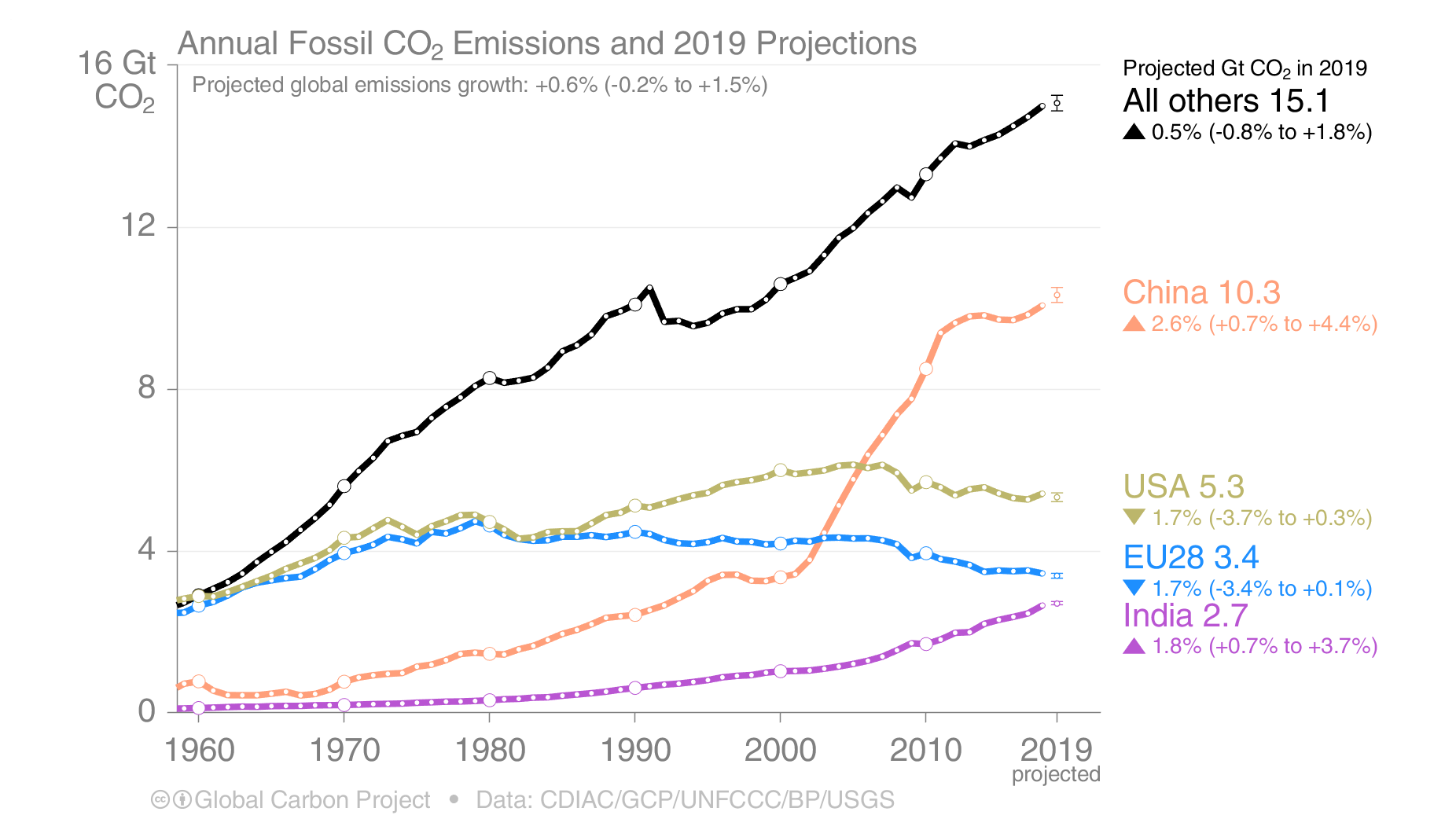
gcp_s14_2019_Projections.png (1852×1042) (arstechnica.net)
Weighting Function - Microwave Sounding Unit temperature measurements - Wikipedia
ESRL Global Monitoring Laboratory - FTP Navigator (noaa.gov)
Data.GISS: GISS Surface Temperature Analysis (v4) (nasa.gov)
ACP - Revisiting the Agung 1963 volcanic forcing – impact of one or two eruptions (copernicus.org)
Australia Bushfire Smoke Now Warming the Lower Stratosphere? – Watts Up With That?
List of large volcanic eruptions of the 20th century - Wikipedia
How Sudden Stratospheric Warming Affects the Whole Atmosphere - Eos
How Sudden Stratospheric Warming Affects the Whole Atmosphere - Eos
Climate change and record cold: What's behind the arctic extremes in Texas - CBS News
1983: "The Coldest Christmas Ever" - Farmers' Almanac
When was the coldest day ever in Houston? (click2houston.com)
NexSeis